Architecture enables, not dictates ways of life. Good design doesn’t have to come with a hefty price tag
Posted on 02-11-2023
This is the story of two housing schemes that depict the spirit of their times in terms of habitation tenets. Their walls and the spaces between the buildings indicate two different, perhaps even opposing, understandings of the relationship between the city and the dwelling and, by extension, between the citizen and the inhabitant. Both stand in Amsterdam, a global city with exorbitant real estate prices and a housing market that struggles, to say the least, to cope with the demand. Yet, both are embedded in diametrically different local contexts. Their scale is antonymous, and so is the sense of containment they transmit to the passerby, in this case, embodied by the author of this post. Conveniently for the purposes of this reflection, both have also been praised, at their respective times, for their architectural qualities. Both were worthy of being considered for the prestigious Mies van der Rohe award; one was shortlisted in 1988, and the renovation of a block of the other took the honour in 2017. However, it is prudent to admit that this might be the comparison of three housing projects, not two. The first is a CIAM-inspired mass housing-led development that offered the solution to the provision of new housing units and increased the footprint of the city in the sixties; the second is a low-rise, high-density, neighbourhood-scale housing scheme of the late 1980s that turned to the street and shared spaces as the foci of human interaction; and the ‘third’ is a 2016 built manifesto for renovating as an alternative to the wrecking ball.
The turbulent story of the Bijlmer
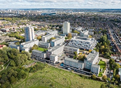
Housing provision is a major societal need and therefore it has always been a major driving force in the development of cities, innovation of building technologies and improvement of people’s quality of life. The outstanding need for providing mass housing that many countries in Europe faced in the second half of the XX century was only a surmountable challenge thanks to breakthroughs in building techniques and new paradigms in the way city planners and architects approached the project of bringing about solutions to the housing shortage. The Bijlmermeer neighbourhood, in south-east Amsterdam, exemplifies this zeitgeist in design, planning and building that was prolifically replicated in many cities around the world. When it comes to modernism, in architecture one word immediately comes to mind: functionalism. As its name suggests, its main feature was the division of functions. There should be a place for living, working, studying, shopping, socialising, connecting with nature, and so forth. All these activities were mediated by the automobile, the great ally of Le Corbusier’s machine for living in, and to a lesser extent, public transportation. The result was a series of nodes of activity that connected by avenues and highways would leave enough space for nature. A greenery that for the modernists was more about visual enjoyment, an oasis thought to be contemplated from the living room of one of the housing units on a high storey of a uniform-looking housing block, reflecting the victory of man over nature, than to be incorporated into the city to accessed directly and casually at ground level.
Some of these influences can be witnessed in the spatial configuration of the Bijlmer, as it is known colloquially. The characteristic heaviness of the volumes, surrounded by the now green areas and small bodies of water, is emphasised by the height and length of the blocks and the modular façades created by the use of precast concrete panels, state-of-the-art technology at the time, and by the deck access, featured by the once glorified streets in the sky. However, the project never reached the expectations or matched the grandeur with which it had been conceived. The utopian dream rapidly turned into a nightmare, the area was not desirable anymore, and the housing corporations that managed the complex at the time were struggling to fill empty units that did not cease to increase due to the constant tenant turnover. A long-lasting process of renewal and redevelopment of the neighbourhood led by the local government aimed at unleashing the promised paradise that never materialised began and some blocks started to be demolished and replaced with lower-rise housing. As though the scenario was not bleak enough, an unfortunate and catastrophic event took by surprise the Bijlmer residents on an October night in 1992, a plane crashed into one of the blocks, causing the deadliest aviation accident in the Netherlands with at least 43 casualties.
Good design doesn’t have to be expensive
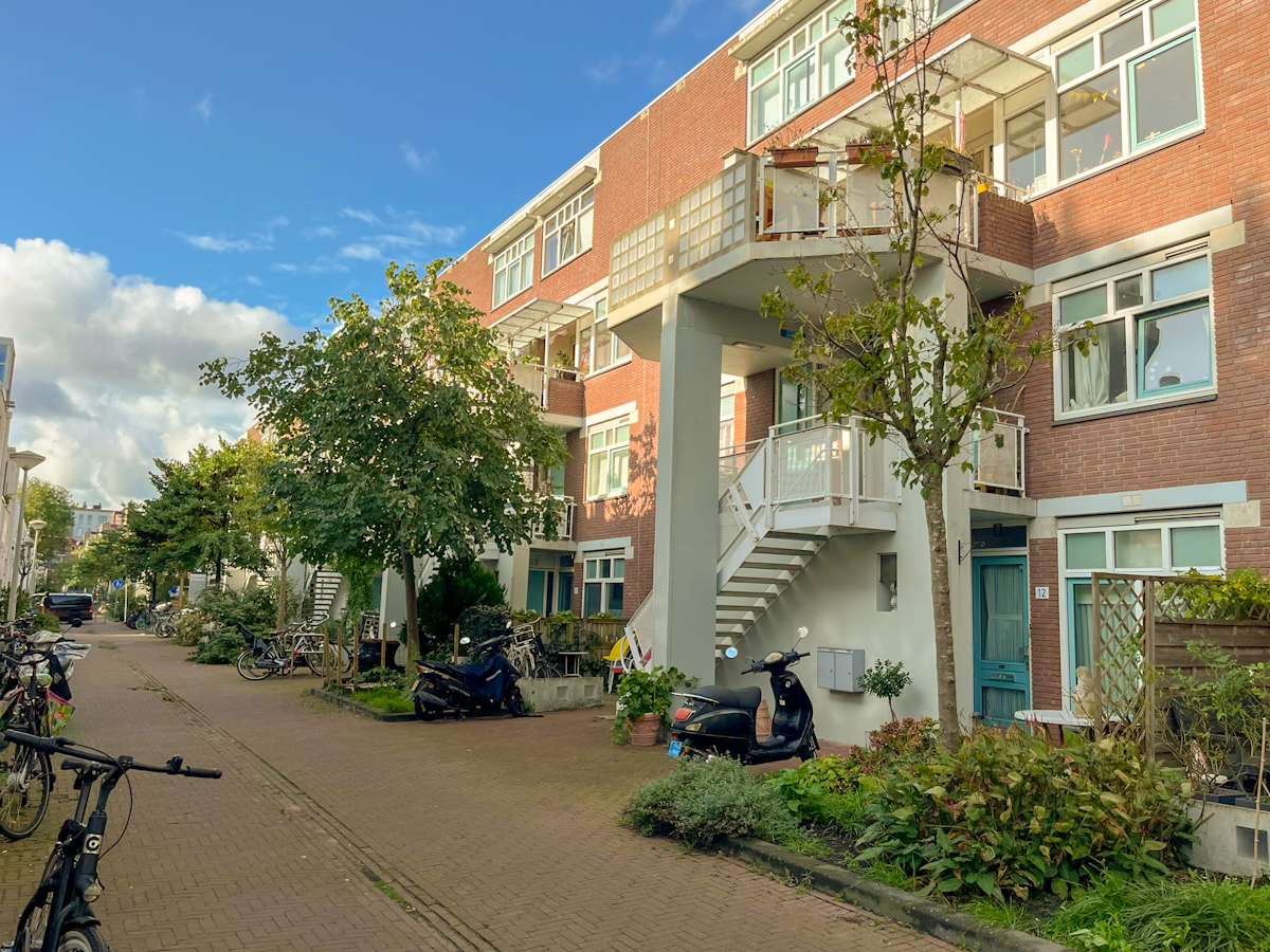
Built in 1987, Haarlemmer Houttuinen Housing was designed by Herman Hertzberger. This housing complex epitomises a paradigm shift that became apparent in the residential built environment in the late seventies and eighties. The large volumes of the Ville Radieuse laid the foundation for a countermovement in design and city-making that returned to relationships between functions and space that are more aligned with the organic development and mix of uses of the mediaeval urban layout. The street becomes the urban living room, a space for socialising that had to be reclaimed from the fast pace of the automobile. Hertzberger incorporates the notion of human scale as a prime consideration in the arrangement of volumes that are noticeably smaller in scale, and malleable at the discretion of the user. It is rather a matter of enabling the users the opportunity to shape their own living environment through possible spatial configurations. The Diagoon housing in Delft (1967-1970) is a preceding experiment that undoubtedly influenced the architect’s approach to this project, which is set in the centre of Amsterdam in a more constrained urban context, with a busy street and an elevated railway on one side acting as a boundary, and the rest of the city with its characteristic lower building profile and tightly packed streets on the other. This dual nature of the site is articulated in two types of façades with distinctive characters, the north is more self-contained, with no balconies or direct access to the blocks in response to the heavily transited road. By contrast, the collective and social side of the complex is placed on the south façade, within the urban block and in a street that has been deliberately safeguarded from vehicles, except for the ones of the residents. This narrow street creates a façade and an urban front that is a world away from the hustle and bustle of its counterpart. Different layers are woven by the use of seemingly ordinary elements of the building. The stairwells that lead to the units on the first storey of the blocks, for example, become a place in itself in conjunction with the pillars that support the balconies that oversee the ground floor terraces, urban furniture and the ubiquitous bike racks that residents have decorated with flowerpots that in some cases have flourished to become urban gardens. Most of the accesses and social spaces of the dwellings are connected to some extent with this shared space and the transition between the public and the private is underpinned by the architectural elements that seamlessly set territorial boundaries. Everyone is a few steps from the ground level so the connection with the street is always present. This is accompanied by the surrounding immediate context composed of housing blocks that have opted to follow a similar approach and pocket parks with playgrounds for children complementing the general neighbourly feeling of a place that is located right in the city centre.
Kleiburg, a second chance for the Bijlmer
In 2016, Kleiburg, one of the surviving blocks in the Bijlmermeer, was to suffer the same fate as other parts of the massive estate designed by Siegfried Nassuth in the 1960s, namely to be bulldozed and redeveloped. Due to the scale of the project and probably after years of underinvestment and lack of maintenance, it was very expensive for the housing corporation that managed it to retrofit it. This modernist brainchild was about to fall victim to the same approach to placemaking that its architects defended decades before: creating a tabula rasa.
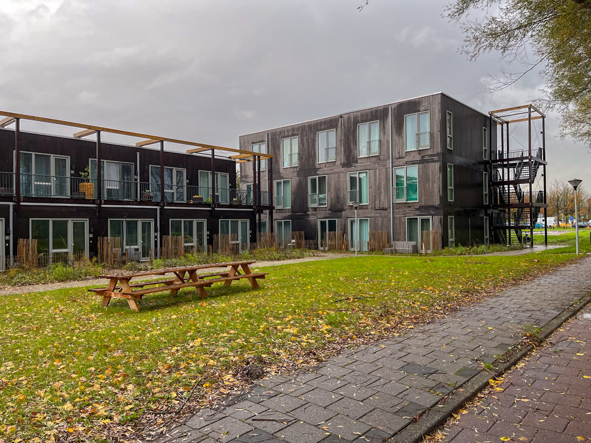
A campaign was launched to save the block and a competition was announced to find out what could be done with the building. In the end, a consortium was selected for its innovative and, above all, affordable approach to retrofitting it. The bigger interventions were focused on correcting flaws in the original structure through purposeful design interventions aimed at reviving the integration of the volume into its surroundings. As highlighted earlier, how a building lands at the ground level and the spaces created by this interaction can have a profound impact on the activities and events that the space between the buildings afford to its inhabitants. In the case of the Kleiburg, a series of poorly conceived underpasses and the use of the ground floor were deemed the culprits. These areas that passed from being envisioned as spaces of congregation and social encounters, to only being used for storage purposes had cut the building off from its context and increased the sense of isolation, anonymity and lack of human scale; that have been linked with perceived or actual higher criminality, anti-social behaviour, and vandalism. Today, the storage rooms have been relocated to the upper levels, closer to the units they are allocated to, and the ground floor lives through infill units that were added in addition to the newly revamped underpasses more clearly announced by a double height and integrated into the pedestrian and cycle paths that criss-cross the site. Elevators have been located in central circulation points and the interior distribution to the flats has been updated to work more efficiently. The interiors of the dwellings have followed a DIY approach reducing the upfront costs that new residents had to cover in favour of a greater agency in deciding for finishes and fittings. Residents can plan according to their budget reducing waste and avoiding extra costs. It is important to note that not the entire Biljmermeer followed this approach, the rest of the blocks are still social housing and are managed by a housing corporation.
The experience of traversing both projects is clearly different. While walking through Haarlemmer Houttuinen, there is a strong sense of place, the pedestrian street is welcoming and it is evident that the residents are in control of their environment, and that they look after it, which in turn explains why it feels alive. A fact that is supported by the sense of containment and positive space that the ensemble creates. The woonerf or living street, a quintessential Dutch way of understanding and experiencing public space, is very much present here. In the case of the Bijlmer, the feeling is almost the opposite. The area is less densely built-up and the blocks look more like a large cruise ship; one perhaps reminiscent of the S.S. Patris, on which the fourth CIAM between Athens and Marseille was held in 1933, where the Athens Charter was discussed and outlined, later to be published by Le Corbusier. Something has changed, however, the blocks still stand, but more like a tree, like those that now thrive nearby, with stronger roots connecting them to the ground and the neighbouring cityscape. In both schemes, the edges and transitions between the public and private spheres have been laboriously crafted to enable a set of relationships that put the experience of the space from the human scale standpoint at the forefront. In 2017, the renovation of the Kleiburg won the Mies van der Rohe Award, a recognition that good architecture does not have to be prohibitively expensive and that there is huge potential to be unpacked in many buildings that sit empty or are being left to rotten.
Further reading
ArchDaily. (2017, March 2). DeFlat / NL architects + XVW architectuur. ArchDaily. https://www.archdaily.com/806243/deflat-nl-architects-plus-xvw-architectuur
Fundació Mies van der Rohe. (n.d.). Haarlemmer Houttuinen Housing. Eumiesaward. https://www.miesarch.com/work/1507
Fundació Mies van der Rohe. (n.d.-a). DeFlat Kleiburg. Eumiesaward. https://miesarch.com/work/3509
Himelfarb, E. (2018, November 13). How Bijlmer transformed from Amsterdam’s no-go zone to the city’s most exciting ’hood. The Independent. https://www.independent.co.uk/travel/europe/netherlands/amsterdam/bijlmer-amsterdam-neighbourhood-a8630071.html
Olsson, L., & Loerakker, J. (2013, April 26). Revisioning Amsterdam Bijlmermeer. Failed Architecture. https://failedarchitecture.com/the-story-behind-the-failure-revisioning-amsterdam-bijlmermeer/
Wassenberg, F. (2013). Large housing estates: Ideas, Rise, Fall and Recovery: The Bijlmermeer and beyond. IOS Press. https://doi.org/10.4233/uuid:667bb070-f469-442b-8d72-54c61f61d884
Author:
L.Ricaurte
(ESR15)


